It was 1972. Who knows, maybe the story is more myth than fact but I can see it clearly. Stanley Eisen (or was it Paul Stanley by then?) was probably driving, Gene Klein (Simmons?) in the passenger seat and Peter Criscoula (Criss for short) in the rear. The three longhairs had recently formed a band and they were discussing potential band names. Gene offered up Albatross, then jokingly (I hope) Fuck. While waiting at a red light Stan (Paul) had an epiphany. Could he have been inspired by Gene’s vulgar suggestion and all its assorted connotations, you know, makin’ out, foreplay…the prelude to the… …or perhaps Paul’s epiphany was inspired by the name of Peter’s previous band, Lips. Maybe it was a little of both, those two words and all that they implied floating about the interior of that automobile, battering Paul’s brain… fuck…lips…fuck…lips…
As the story goes, sitting there at the red light, Stan (Paul) simply blurted out:
“How about Kiss?”
Gene nodded. Peter nodded. Green light.
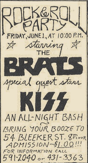
Paul Frehley joined the band in late 1972, by which time Stan had definitely renamed himself Paul Stanley. Luckily Paul Frehley had a cool nickname, Ace. It was Ace who first sketched out a crude design for what would become the band’s logo. Paul Stanley remembers sitting at his parents’ kitchen table in Queens with a protractor, a ruler and a mechanical pencil turning Ace’s idea into the iconic logo instantly recognizable worldwide today. Do you think it crossed his mind as he sat there in his parents’ kitchen that he was making history? I think it might have. When exactly this all took place is unknown, but on a flyer for a June 1, 1973 show at the Bleeker Street loft occupied by fellow NYC rockers The Brats a very basic version of the logo was used.
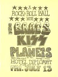
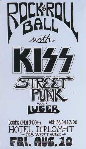
By July 13, 1973 a crudely drawn but more familiar version of the logo appeared on a flyer for a show with The Brats and The Planets at the Hotel Diplomat on 43rd Street.
A month later on a flyer for an August 10, 1973 sho
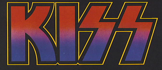
w, again at the Hotel Diplomat, Paul’s iconic design first appeared in all its glory. The design of the logo on this 1973 flier is essentially the same design the band uses to this day, warts and all. If you look closely you can see that the lines in the S’s are not quite parallel.
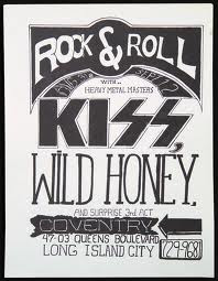
But still, a month later on a flyer for a September 1, 1973 show at the Coventry in Queens a slightly different design appears with straight K. It is unknown who exactly created the flyers, or when, so why Paul’s carefully crafted logo from the August 10 flyer was not used for the September 1 flyer is a mystery.
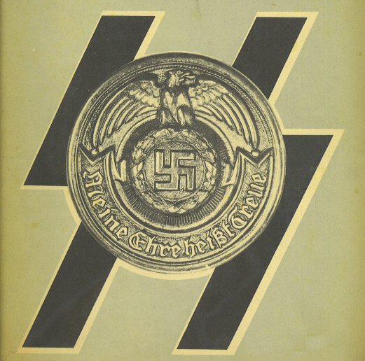
The elephant in the room when it comes to the KISS logo is the SS, the dreaded Schutzstaffel, which translates to Protection Squadron or Defense Corps. The SS was Nazi Germany’s brutal and sadistic paramilitary police organization, an instrument of evil more infamous than infamy itself. There is no denying the stark reality that the double S in the KISS logo distintly resembles the double S used by the Schutzstaffel.
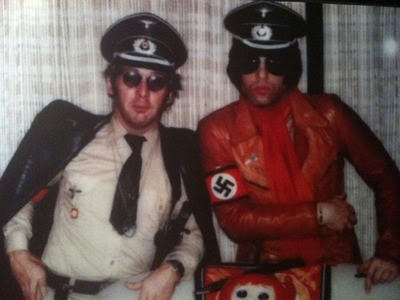
Ace Frehley has spoken publicly (and wrote in his book) about his interest in World War II history and memorabilia and most KISS fans know the story about Ace spending thousands on vintage Nazi uniforms and the photo shoot that followed.
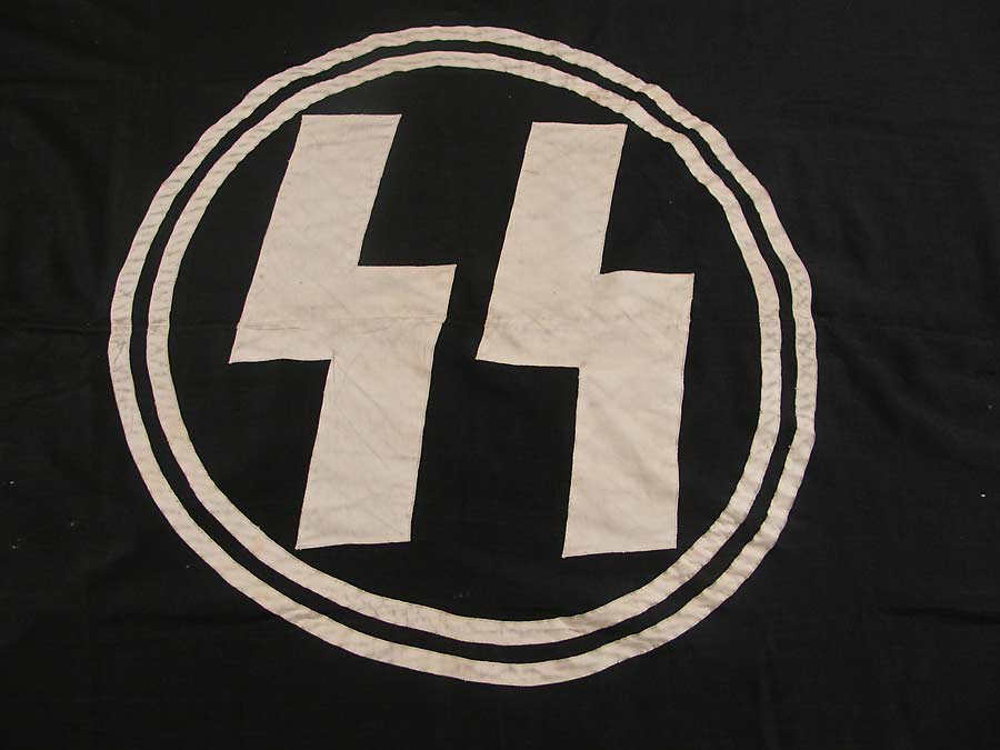
Of course Paul Stanley’s participation in said photo shoot makes it appear less than nefarious, considering the fact that he is of course Jewish. Obviously the guys were just being goofy, but it was certainly in poor taste. Gene Simmons tells a story about Ace Frehley knocking at his hotel room door dressed in a Nazi uniform and giving him a Nazi salute. Perhaps (perhaps!?) Ace was drunk, perhaps it was the same night the above photo was taken, or close to it, but the fact that Gene’s mother was a holocaust survivor who saw most of her family wiped out makes Ace look like an idiot or worse. Taking all of this into consideration, and knowing that it was indeed Ace who first envisioned the lightning bolt double S in the KISS logo, and of course knowing that lightning bolts were also the inspiration for the double S on the Waffen-SS flag below…
…it seems to me perfectly reasonable to assume that Ace’s concept for the KISS logo was in some way (consciously or not) inspired by or in reference to…oh dear…an organization made up of perhaps the most heinous maniacal murderous vermin to ever have existed.
Was it Ace’s idea of a joke? Black humor? Is that the dark legacy of the KISS logo? Or was it just a cool freakin’ design?
You might say, at this point, who cares, and in part I agree. But…
This website uses cookies so that we can provide you with the best user experience possible. Cookie information is stored in your browser and performs functions such as recognising you when you return to our website and helping our team to understand which sections of the website you find most interesting and useful.
Strictly Necessary Cookies
Strictly Necessary Cookie should be enabled at all times so that we can save your preferences for cookie settings.
If you disable this cookie, we will not be able to save your preferences. This means that every time you visit this website you will need to enable or disable cookies again.